Sweating the details: Navigation
 josh.ferrell10min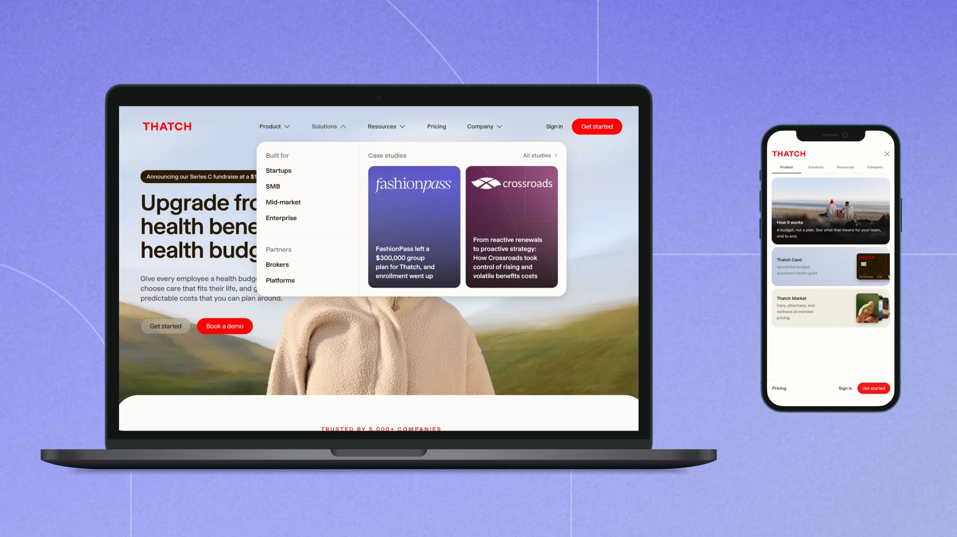
This is part one of a series of articles about how we built our Thatch.com site and prepared for our major rebrand.
Navigation is a crucial part of any website as it's the first piece that people interact with, but unfortunately many sites fail on accessibility or ship a half-baked mobile experience. At Thatch, we want to build an experience that is as high quality as an operating system where our components are beautiful and accessible.
Tabbing
Sara Soueidan has a great article about how to build accessible navigation that inspired much of our tab experience. When tabbing through a navbar, you should be able to tab between each nav item and an aria-expanded attribute should exist on the dropdown triggers that allow screen reader users to know that interacting with this item will expand the dropdown. Then when it's expanded, all of the items within the dropdown should be added to the tab order.
Shift tabbing when at the top of the dropdown should move back to the navbar toggle, and tabbing at the end of the dropdown should move to the next nav item. Once the dropdown is closed, the tab items are removed from the tab order entirely.
This technique makes for a much better keyboard navigation experience, as people are able to quickly tab to the section that they want rather than having to tab between every single tab item in order to get to the help page which is in resources.
Keyboard navigation
For a navigation menu, most keyboard users will probably use tabbing to navigate, but we wanted to make sure that menu style keyboard controls still worked. This includes things like when tabbing to a dropdown item and pressing the down arrow, the dropdown should expand. Once expanded, pressing the up and down arrow keys should move through the list items.
There are multiple keyboard controls that are built into operating systems like macOS though beyond just arrow keys. Pressing Home and End should take you to the start of the list and end of the list respectively. And when the dropdown is collapsed, pressing ⌥ + Down should expand the dropdown and ⌥ + Up should collapse the dropdown.
Something that's rather unique to macOS is that when VoiceOver is active, the operating system will make menus behave like a combobox where ⌥ + Up and ⌥ + Down will expand and collapse menus. When VoiceOver is inactive, it'll instead act like a home and end shortcut. This is very useful on laptops where the Home and End keys don't exist and the user may not know about using function keys as the alternative.
Because the browser doesn't relay to applications whether someone is in screen reader mode or not, we find a middle ground, where if you're at the start of the list and press ⌥ + Up we close the dropdown and if you're not, we go to the top of the list. We may test this further and decide that we should use screen reader detection techniques when the menu is opened to determine if this behavior should be closer to the OS.
Finally, one keyboard navigation style that is almost never implemented is ⌃ + N and ⌃ + P. This navigation comes from macOS sharing DNA with Emacs and many of the controls for navigation in Emacs exists in macOS. In most macOS applications, you are able to press ⌃ + P to move up a list and ⌃ + N to move down a list. Our goal is to build an OS-quality experience within our Slab components so this is something we bake in. If you used a native HTML select, you would get this behavior for free (though not if you apply custom select css rules).
Determining focus
The behavior for a popover like a navigation dropdown should not trap focus but we do want to bring focus into the dropdown when it's opened. However, something to note is that if someone is using a mouse and not a screen reader, we don't necessarily want focus to be brought in as that can trigger :focus-visible styles which isn't ideal. Instead, we want to determine if the click was a synthetic click or not.
To determine if an element was clicked with a synthetic event, you can simply check where the item was clicked. Most screen readers will click an element in the exact center, like VoiceOver. In these cases, you can make a very small area where if that pixel was clicked, you know it was likely a screen reader which performed the click. If a screen reader performed the click, you should bring focus into the dropdown. Another thing to note is that if the click was performed with the mouse, and VoiceOver is active, it will still click the exact center of the button.
Handling hover
The web can be very inconsistent. On some sites, a mega menu will automatically open for them while hovering, and on others it may require a click to toggle. We wanted to have our menu open on hover, but this poses a problem when someone may expect to need to click the buttons to open the dropdown. If someone clicks the dropdown immediately when the hover open state activates, they could close the dropdown. Since we have an animation when opening a dropdown, it could appear like it's a bug because nothing would happen after clicking.
Instead we create a lock mechanism which blocks clicks from doing anything for the first 500ms after hovering. If they click after that 500ms happens, we close the dropdown and treat it like a toggle button. This gives them enough time to see the dropdown open and prevents that first click that would happen when moving the mouse over the dropdown.
Sticky mobile navbar
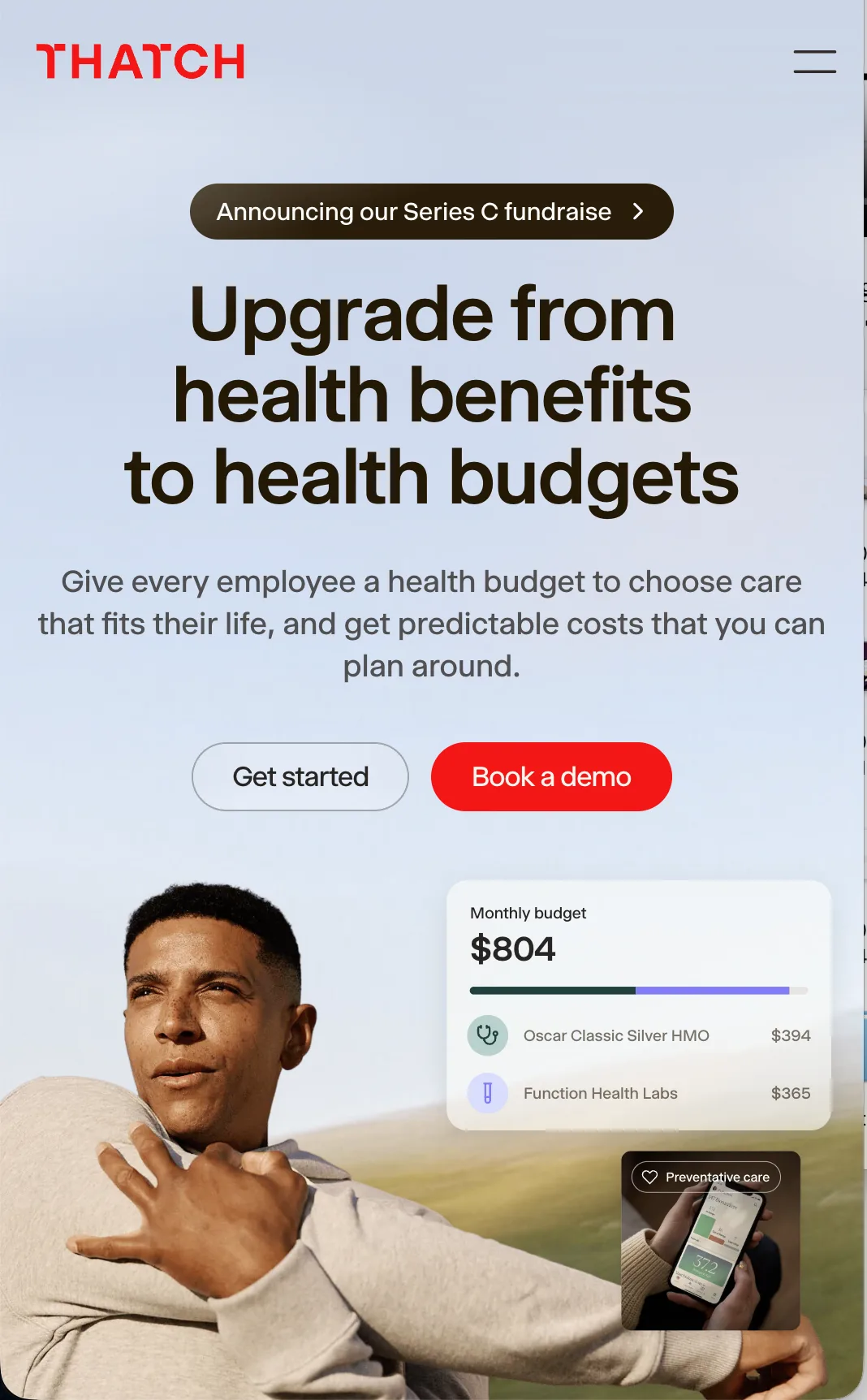
For mobile devices, we break our navigation down to become a sticky topbar. This creates a few things that we needed to handle. For instance, when scrolling in a page that was dark or loading a page like /platform which has a dark mode hero, we needed to make sure that our logo and button had proper contrast. To handle this we have <section> tags peppered in our site which have different light or dark backgrounds. Because they're in a consistent HTML tag, we can perform a query as we scroll to see if any new sections intersect with our navbar.
Each <section> tag has its own background class applied to it with tailwind: bg-[#fff] which can be light or dark, or in some cases we have a data attribute which specifies if it's dark or light. When our navbar intersects these sections, it determines which dark or light mode it should be in.
For our background color in the sticky navbar, we went with a blur effect described by Josh Comeau which adds additional functionality beyond the normal backdrop-filter: blur() technique like blurring elements near the navbar rather than what's directly behind.
If you look at how frosted glass behaves in real life, light bounces off the glass when something is near the glass, not just when it's directly behind it. By using this technique we get a much nicer blur effect than what we would have gotten using the backdrop-filter alone.
Finally, when the sticky nav hits other parts of our app that are also sticky, like the table of contents on a blog post, we extend that background's height to contain the table of contents. This allows the blur effect to be a single blur rather than having two sticky divs creating their own blur next to each other which creates a "border" between the items.
Swiping between tabs
For our mobile experience, we have our navigation broken up into tabs. One feature that we added with this is that when you swipe in the tab panel area, it changes between the tabs. We felt that this was really nice for mobile users because the tabs were positioned high up. While users may not expect this to work, once you discover it, you start to feel like it should exist everywhere.
Handling micro-animations
We added a ton of micro-animations to the site and there are many rules that we established for ourselves when adding something that had an animation.
Animations shouldn't be distracting
When we explored different options for hamburger icon animations, we found that many felt distracting.
Tap a card to play the animation
We then explored a version where it collapsed into itself and transitioned into an x. Our first iteration had a slight pause with the animation curves, and we ended up making a version which was more fluid.
Tap a card to play the animation
Animations shouldn't win over interactivity
When interacting with the site, it should never feel "slow" when interacting with something. For instance, it's possible to add ease-in curves to everything and make things feel smoother, but this also means that things feel much slower. The rule we settled on is that the response to an interaction should happen immediately, but the animation describing it is allowed to take its time. Because of this, most of our menu animations aren't symmetric. Our mega menu opens over 460ms with a slight overshoot, but it closes in 150ms. People aren't really looking at a menu while it's closing, so matching the timing in both directions would just make the site feel slower for no benefit.
Once the menu is already open, moving between items like Product and Solutions doesn't close and reopen the dropdown. Instead the surface morphs into the size of the new panel while the panels cross fade inside of it, and we fade the outgoing panel out faster than we fade the incoming one in so that you're never waiting on old content to disappear.
Animations should obey motion sensitivity
Many people are sensitive to motion animations when browsing the web, typically they'll have an accessibility setting like reduce motion enabled on their device. In these instances, we make sure that we have disabled all of our animations when this setting is active.
Animations should have natural progression
When we add an animation, we want the motion to run along the same axis as the thing it's describing. A common way to build a dropdown chevron is to rotate it 180 degrees when it opens, but then the chevron sweeps sideways while the panel it controls is moving straight down. The two motions disagree with each other, and the rotation ends up being the distracting part. Instead we animate the endpoints of the two lines that make up the chevron so that it flattens in the middle and reforms pointing the other direction. It hinges on the same vertical axis that the dropdown travels on.
The CTA arrow on our feature cards is the same idea going in another direction. At rest it's a chevron pointing to the right, and on hover the whole icon moves to the right while the shaft draws out behind the arrowhead, turning it into a full arrow. Because the arrowhead was already pointing at where the link goes, the movement and the shape change both happen in the same direction you'd be traveling if you clicked it. It feels more like the chevron is completing itself than like it's being swapped out for a different icon.
What's next?
We put a lot of work into this navigation, and we're going to have more coming soon about the animations in our site as well as a breakdown of how we built our design token system!