Rebranding Thatch
 jared.fanning10min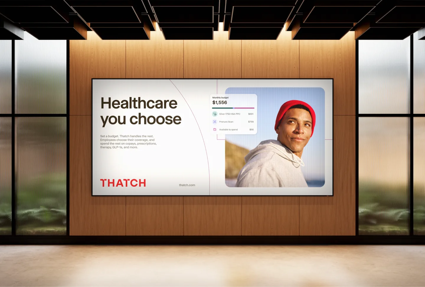
Thatch has grown a lot since I joined a year ago.
The team scaled from 50 people to nearly 250, and our product has expanded to meet more of what our members and employers need to support their healthcare.
A few months into my role, it was clear that while the company was growing quickly, the brand wasn't keeping up. When I shared this with our founders, Chris and Adam, they'd been feeling the same thing.
When we started Thatch, we were focused on building for companies like us — busy startups that wanted easy, flexible benefits. But our customer base quickly diversified after launching, and we needed something more mature and human-centered that better reflected the customers we now serve.
So we decided to make "year of the lighthouse brand" one of our key company initiatives for 2026, and got started developing an entirely new look and feel for Thatch.
The logo: weaving something new
Our old identity felt a little too "blurple tech startup" for the healthcare platform we'd become. We have more than 5,000 businesses on Thatch now, and — although tech is still our largest category — more than 80% of Thatch users aren't technology companies. Our brand didn't resonate with members navigating their care on Thatch, and it no longer met the quality bar our design team held ourselves to.
Adam and Chris named the company Thatch, maybe because the url was available, maybe inspired by a Robert Frost poem, but also because thatching means weaving individual strands into something whole, protective, and strong. Much like a roof. We think that's a pretty good goal for healthcare too.
Early explorations
We partnered with Jason Marder to help us create our new brand identity. Throughout the process we were so impressed with the level of design craft he put into every detail.
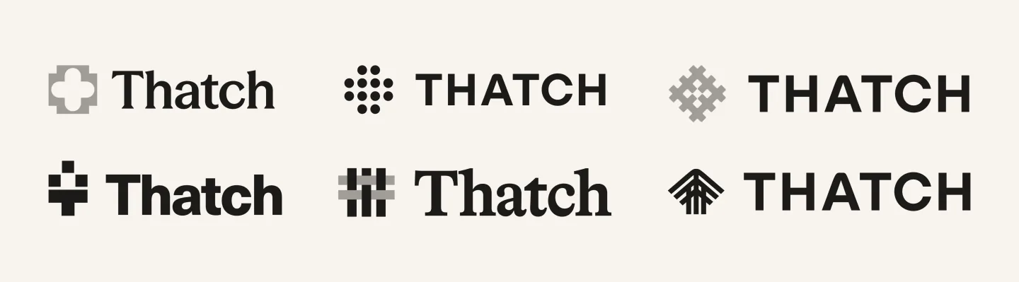
Jason led the team through some early workshops, and then explored a range of directions built around metaphors of thatching and healthcare.
Pathways + Pixels
As we kept talking about our brand, we naturally talked a lot about healthcare.
Traditional group healthcare today is often treated as one-size-fits-all, but healthcare looks different for everyone. It’s made up of millions of individual journeys — moments, connections, and choices — that we thought of as the pathways people navigate through their care. And much like thatching itself, our goal is bringing those individual pathways together into something whole on Thatch: a healthcare system people actually love.
So we explored how our identity could reflect this concept of individual choice and journey, and the boldness it takes to build it.
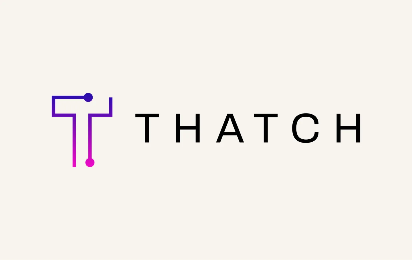
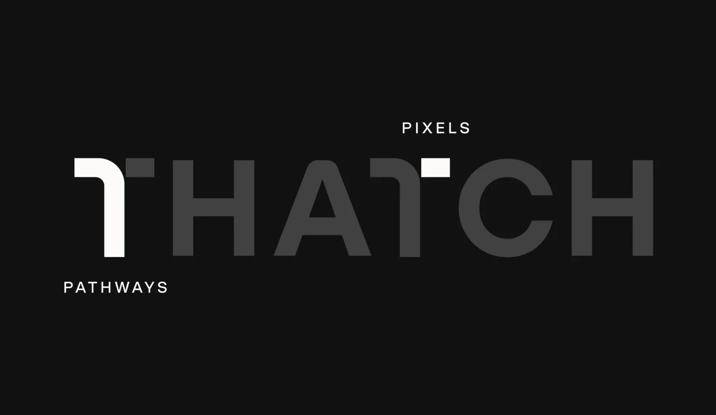
We landed on “pathways and pixels” as the core brand theme: pathways for the human journeys people navigate, and pixels for the tech infrastructure we build that makes it all work together.
A quick aside: a week before launching our new brand, ICHRA was renamed to "CHOICE" (Custom Health Option and Individual Care Expense). We love this new acronym since the model behind Thatch has always been about exactly that: choice.
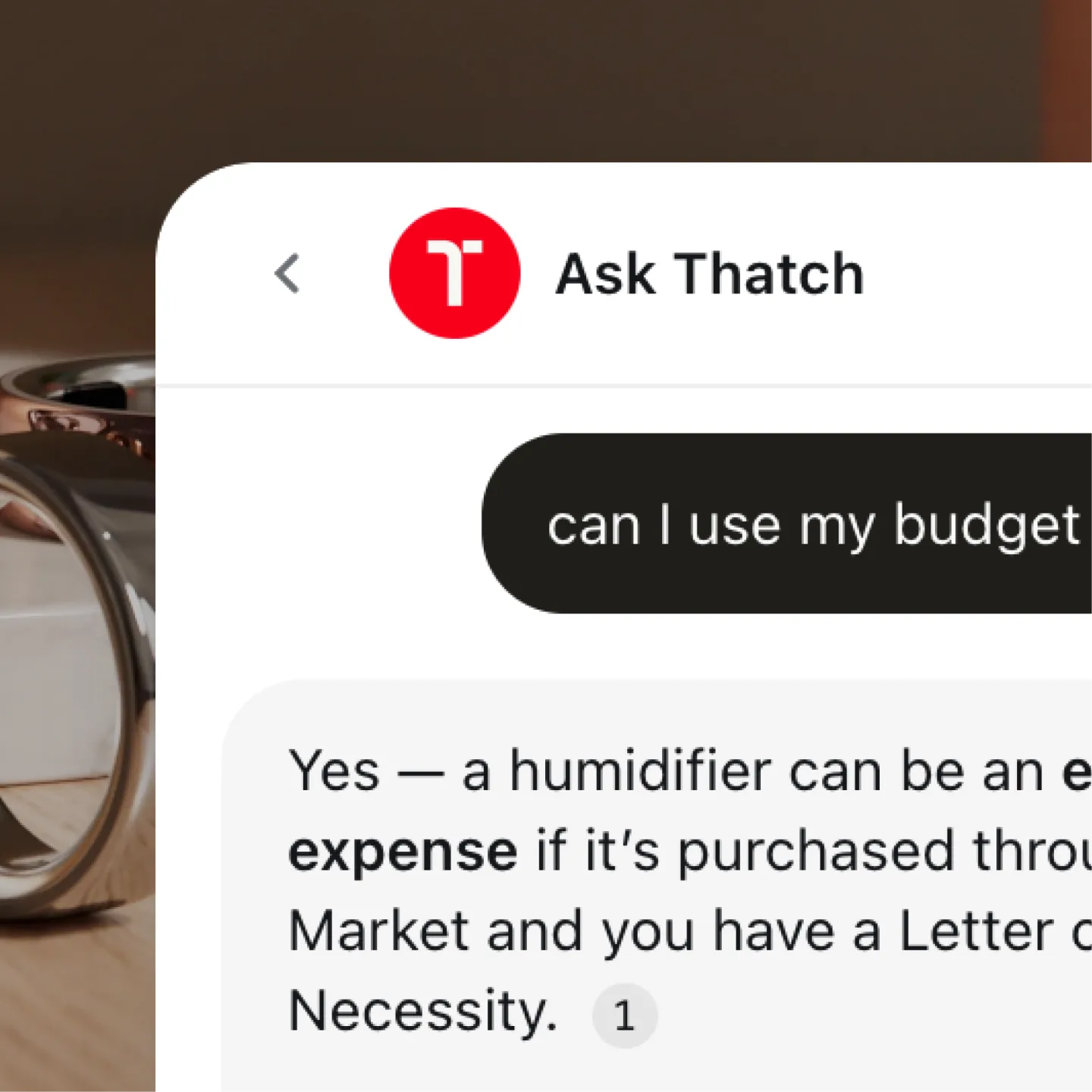
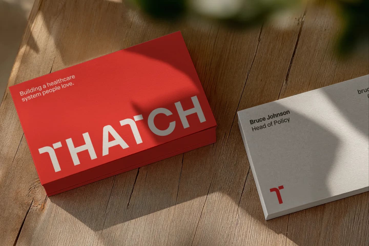
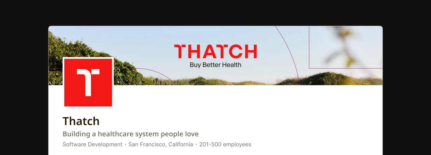
One of our challenges was creating an icon that could stand on its own without feeling disconnected from the wordmark. Jason folded the two together beautifully. That was the moment it all clicked.
Brand elements
Color: a bolder pulse
Most brands in our category lean heavily on blues and greens, colors that signal “trust”, but can also feel pretty institutional.
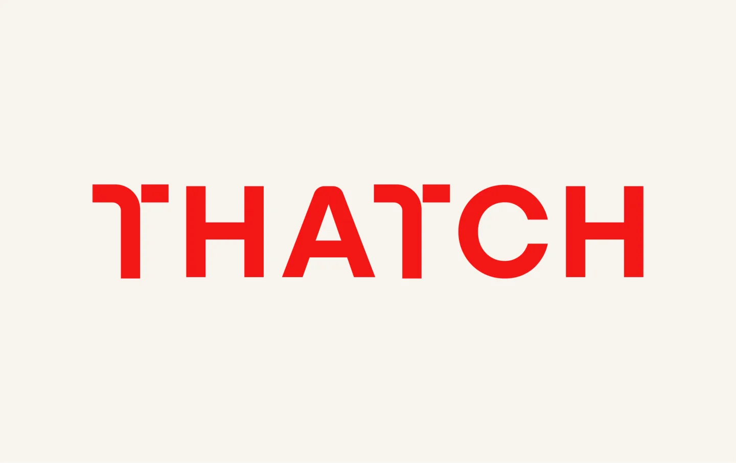
We wanted something a little more human and a lot more Thatch. Surprisingly, red was one of the boldest and easiest decisions we made. Turned out, Chris and Adam had landed on the exact same idea in a completely separate conversation.
Red feels alive. It reflects the warmth, energy, and compassion we bring to our work. It's the color of love and a tie-in to our mission statement: to build a healthcare system that people love. There’s a little bit of our history in it, too. Our original logo was built around a heartbeat line, and red carries that idea forward into this new chapter of Thatch.
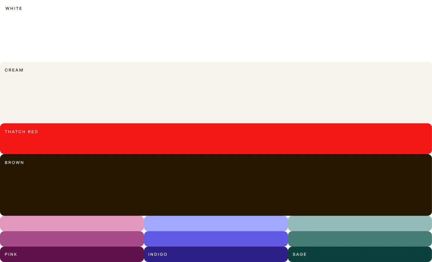
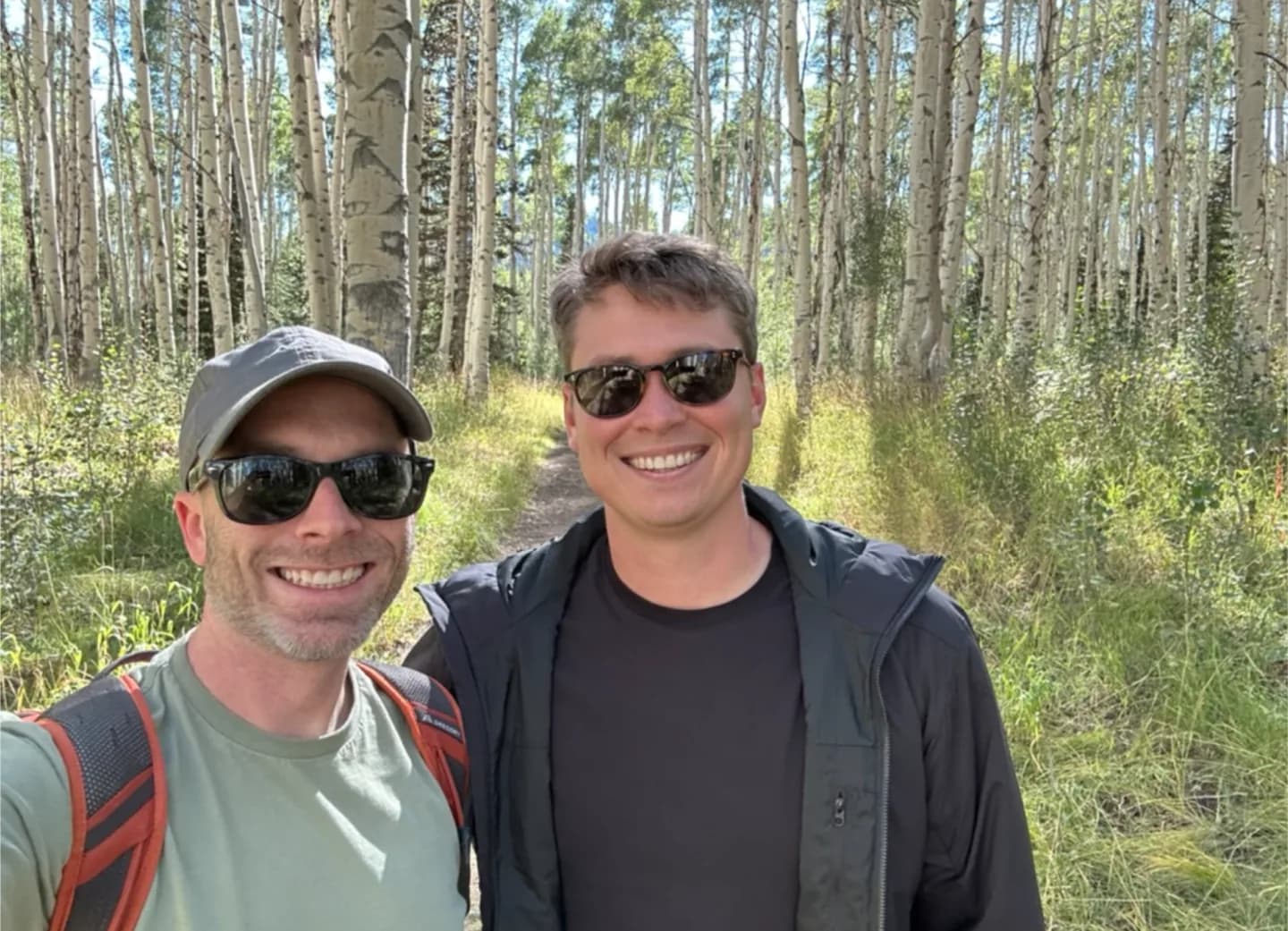
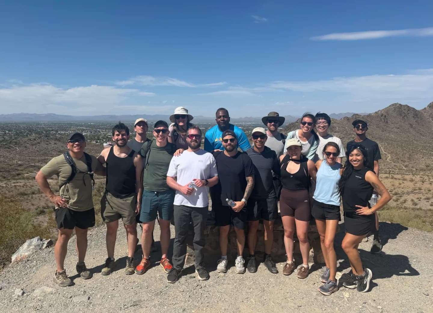
Alongside Thatch Red, we built a secondary palette pulled from nature: using softer pink, indigo, and sage, alongside warmer creams and browns. While nature is an aesthetic reference for us, it also reflects our team's culture.
Typography: functional and human
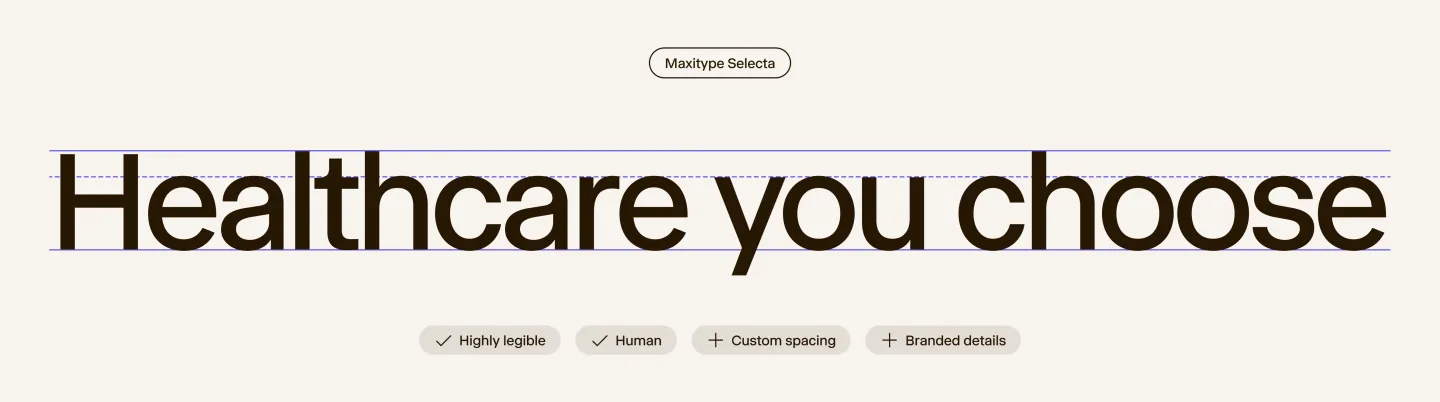
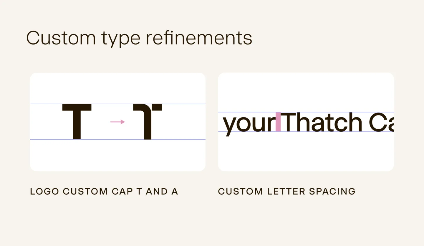
Jason also recommended Selecta from Maxitype for our new typeface. It's an approachable sans with real functional range: geometric enough to feel structured and technical, and expressive enough to feel human.
Imagery: built around people, not plans
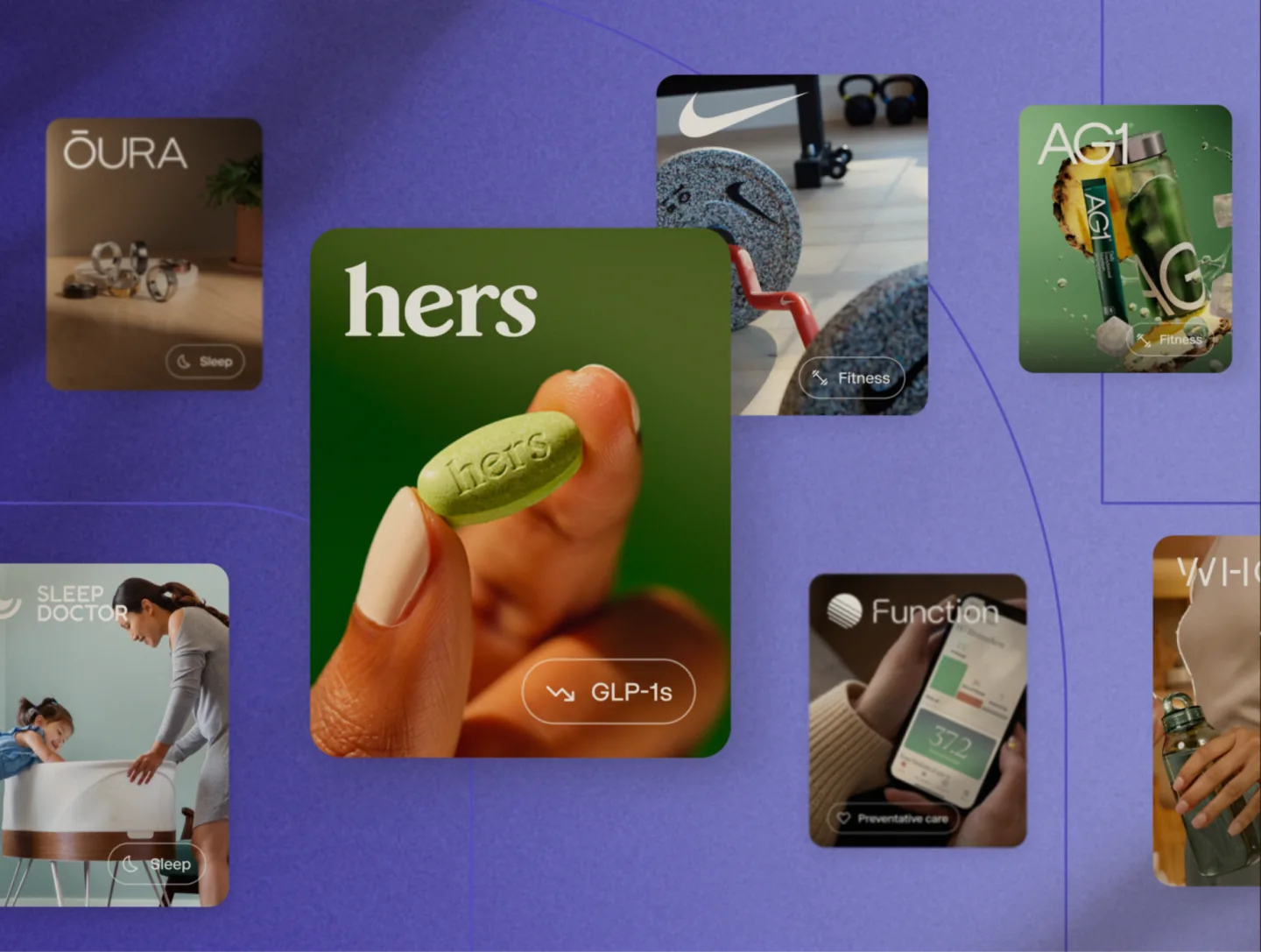
In the past, Thatch leaned heavily on our product UI for imagery and mostly avoided photography, largely to steer clear of the stock, cheesy office-health-insurance imagery that dominates the industry.
Avoiding photography altogether also meant missing an opportunity to show the people at the heart of what we do.
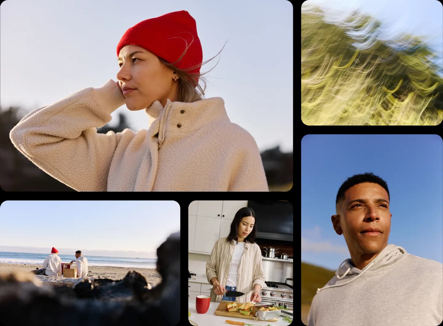
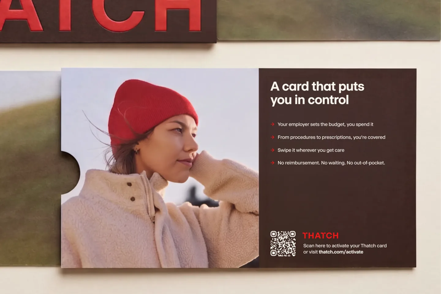
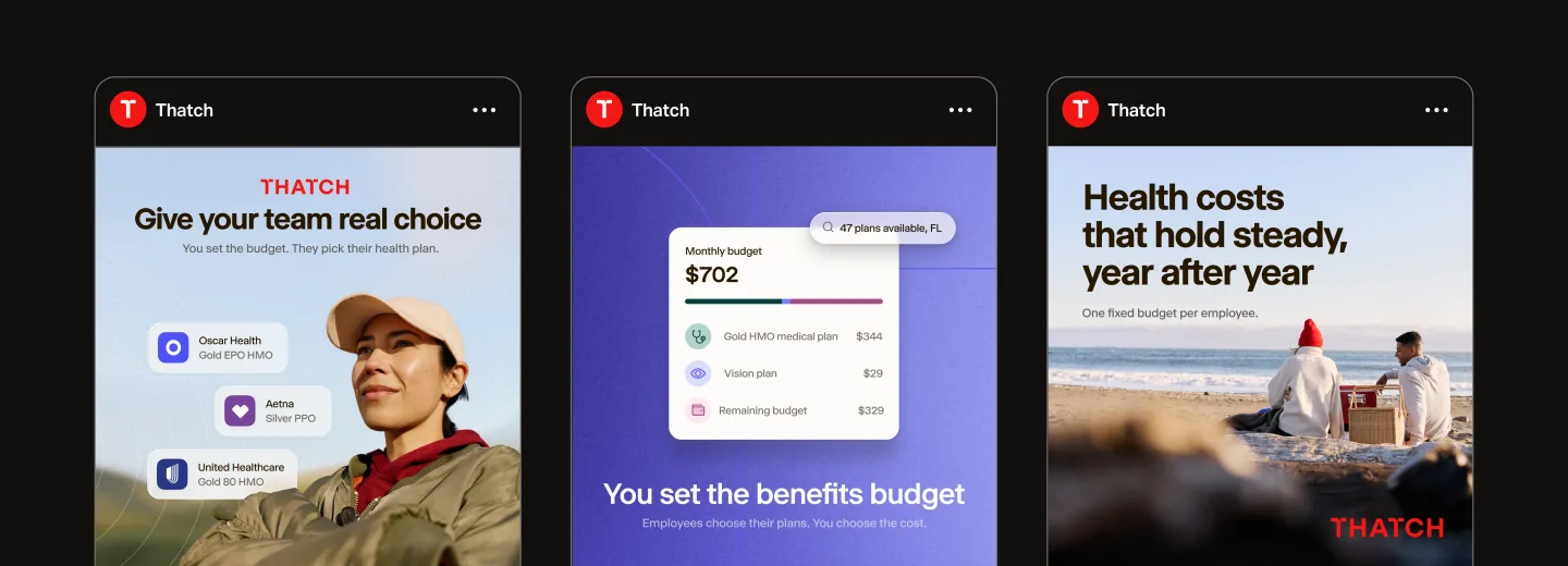
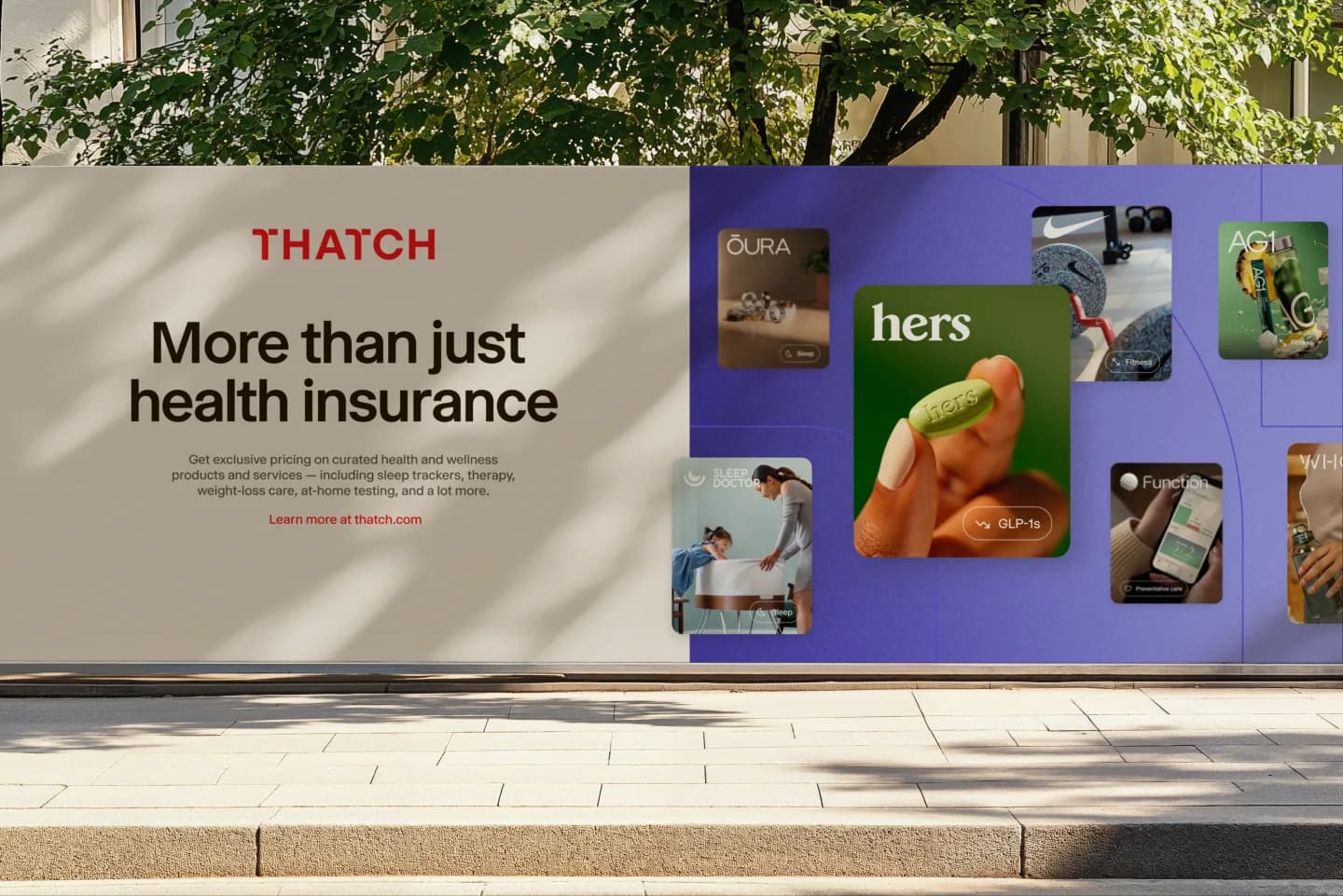
Our goal for imagery was to reflect that healthcare is built around people, not plans, and that it can look different for everyone. Real people, real moments, and a sense of some of the things they juggle outside healthcare.
It mattered to us that we represented real humans with clear creative direction, so we worked with photographer Evan Robinson on a photo shoot to create a library of brand photography rather than reaching for AI-generated imagery or generic shots from stock services. We spent the day shooting thousands of photos with Evan and his world-class team in Marin on a beautiful day in May.
Graphic elements: bringing it all together
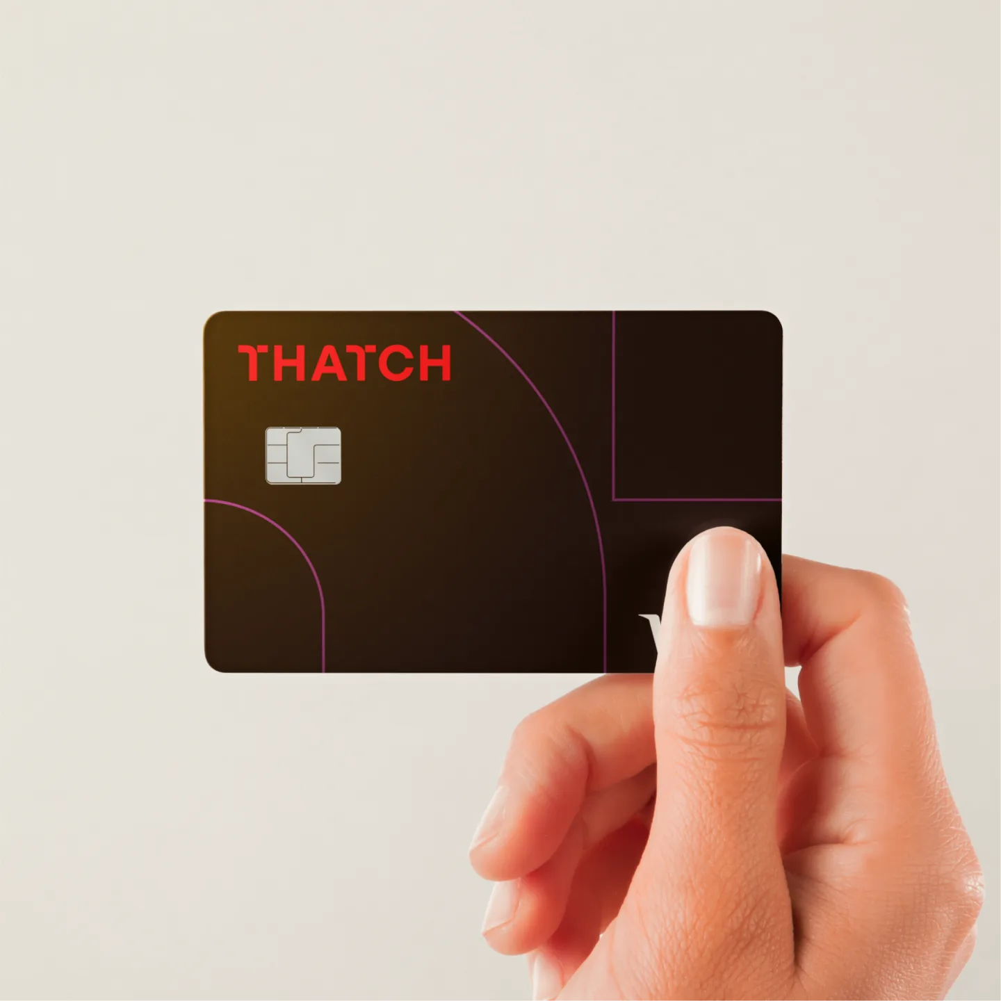
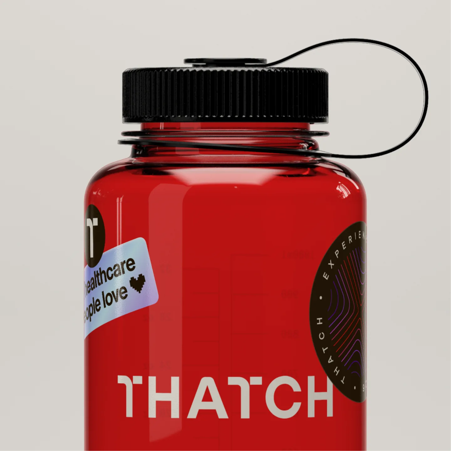
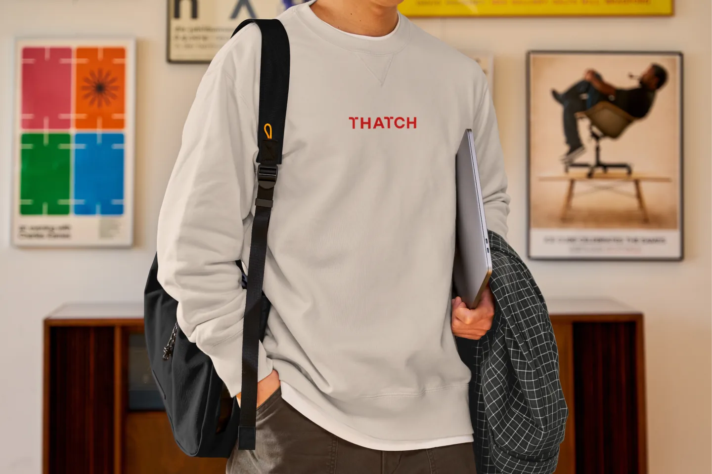
We use the T as a graphic pathway element alongside grainy gradients and nature imagery that represent pixels. These layers and backgrounds add dimension and a consistent sense of energy across our brand.
Website
With the brand foundations set, we turned to bringing the system to life on our site. Some of the best ideas actually came from working with our eng team, David Santoso and Justin Sippel (and Adam!) and spent months moving back and forth between the initial brand work and the site. The result is an entirely new site that we feel fully represents the next chapter of Thatch.
We brought in Jonnie Hallman, a design engineer who’s created some of the best animations for Stripe and other iconic companies, to help take the pathways idea and build into the site itself. He came back with some amazing concepts — and sprinkled that same magic across several other site components as well, like animating the logo. It was always inspiring to peek into "the Jonnie Zone" during our time together to see what he'd been cooking up.
Product: an end-to-end facelift
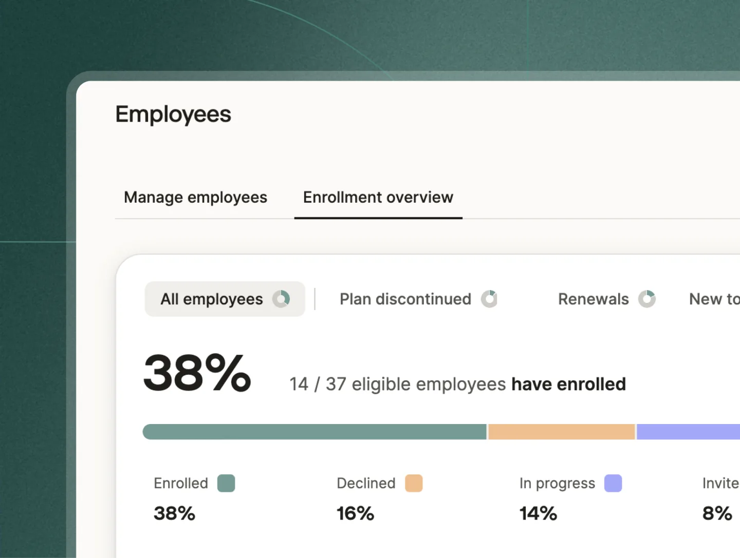
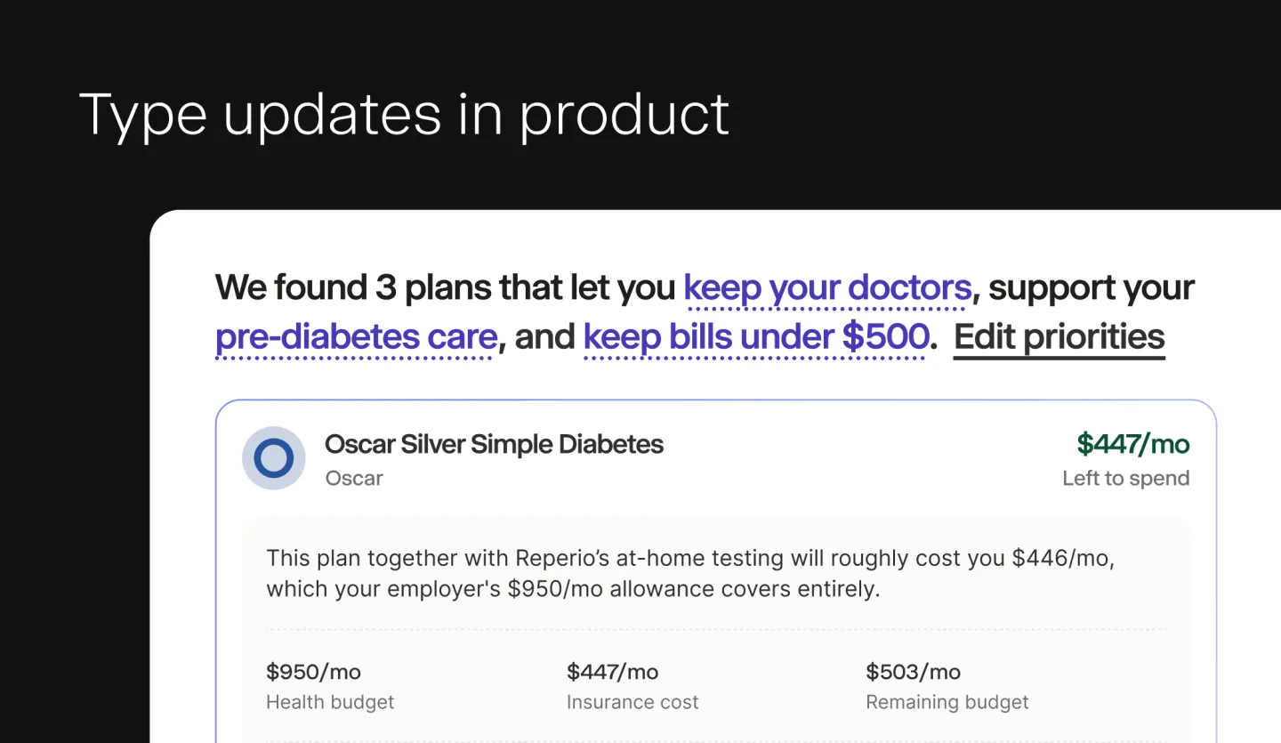
Consistency mattered here as much as anywhere else. To start, we’re bringing in the new colors and refining a handful of key experiences to feel more considered.
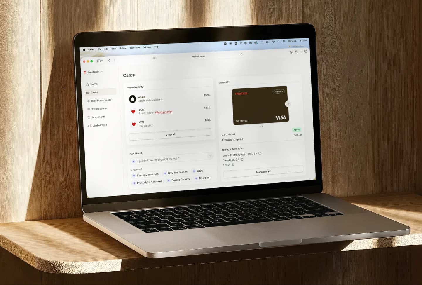
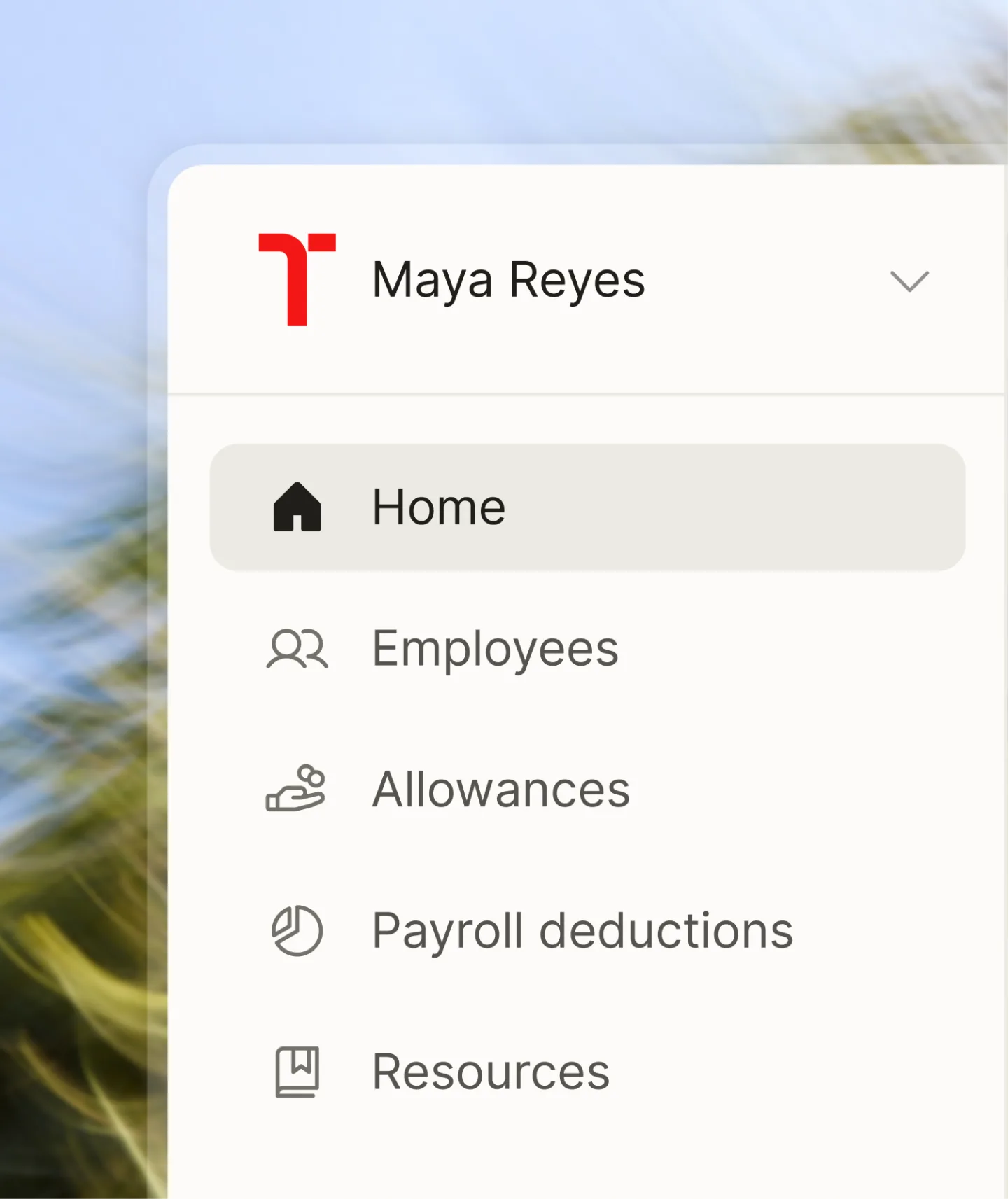
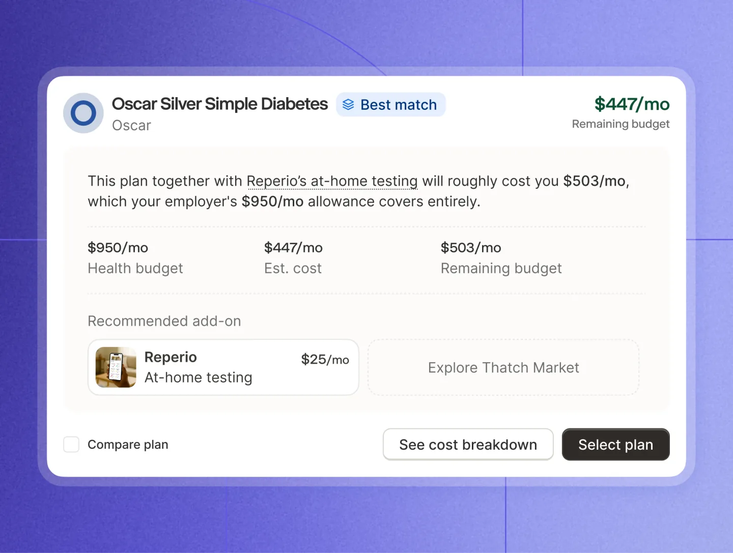
For our design system (Slab) Josh Ferrell and Joe Weber shipped new design tokens and updated our icon library — a huge win for consistency and developer velocity going forward. These are just the first steps in a broader product refresh we're excited to keep building on.
Just getting started
This past week we announced our Series C, and it feels like the right moment to share this next chapter of Thatch's brand. The funding gives us room to go further on building a healthcare system people love, and our new look helps ensure that we’re better connecting with the people we’re serving.

A brand, like a garden, is never really finished. It's something you have to keep tending. That's part of why David and I started Cultivate the Garden, our product review ritual at Thatch where we walk through the product as a team, and find what needs pruning, watering, or even re-planting. The same is true of our brand. Now comes the ongoing work of making Thatch feel like Thatch everywhere, across product, marketing, sales, events, and all the small journeys in between.
Recognition
A rebrand is never a small project — there are a lot of stakeholders, and even more opinions, to bring along. Huge thanks to everyone who worked on this over the past several months.
Collaborators
Logo: Jason Marder
Photography: Evan Robinson
Web motion: Jonnie Hallman
Thatch team
Engineers: Josh Ferrell, Justin Sippel, Joe Weber
Engineering Lead: David Santoso
Brand Designer: Sarah Adler
Product Designers: Karl Baranov, Leon Han, Iulia Soare
Design Lead: Jared Fanning
Content: Aliza Niewood
A big thanks to the leadership team at Thatch who are always so thoughtful to work with. Chris and Adam really believe in the value of design and care about the details. Thanks to Leslie for joining a month(!) before launch and helping us land the rollout.
Chris Ellis: CEO & Co-founder
Adam Stevenson: President & Co-founder
Leslie Lee: Chief Marketing Officer